BY TASHIA PARKER | WHITE BEAR CO.
If you're staring at your closet trying to figure out how many colors you need for your session — good news: you don't need a rainbow. Some of the most timeless, elevated-looking photos come from just two colors. Here's how to pick them.
You Don't Need a "Full Palette"
It's easy to assume a great photo needs lots of coordinated colors...blush, sage, mustard, navy, cream, all at once. Actually, the opposite is true. Fewer colors, chosen intentionally, photograph better than a lot of colors trying to coordinate.
A strong outfit palette usually breaks down to just:
- One neutral — ivory, cream, white, sand, or taupe
- One accent color — something more saturated, like cornflower blue, terracotta, emerald, or wine
- Green, from nature — grass, trees, and florals do this for you for free
That's it. Two colors you choose, plus the natural green around you, is a complete look. It's not missing anything... it's simple on purpose.
Why Two Colors Photograph So Well
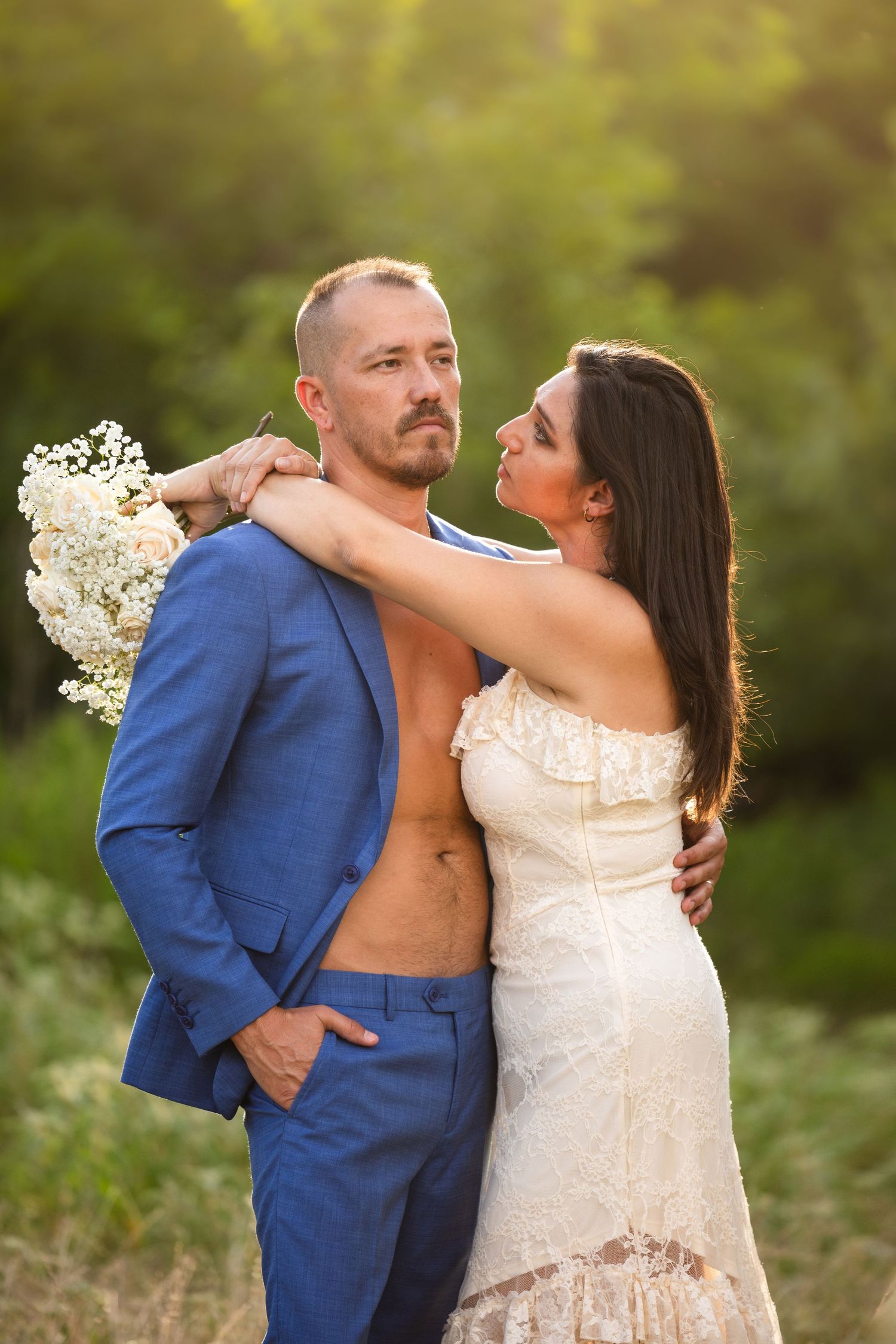
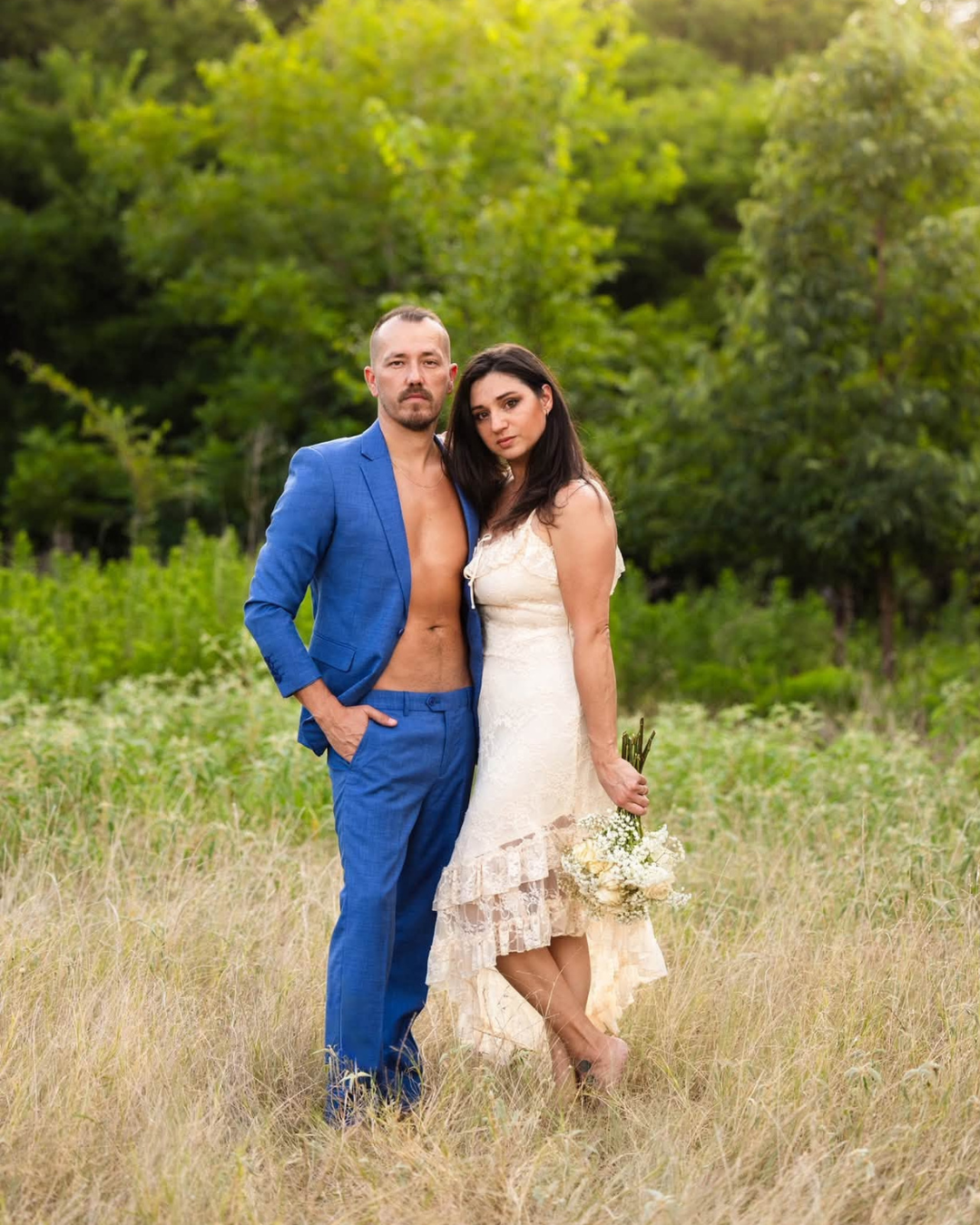
- Contrast creates focus. A warm neutral next to a cooler accent color (like ivory next to cornflower blue) draws the eye straight to you, instead of competing with a busy, cluttered look.
- Your skin becomes part of the palette. Warm, sunlit skin tones bridge the neutral and the accent color — this is part of why golden hour looks so good. It adds warmth without you having to add another item of clothing.
- This is the same approach used in high-end wedding and editorial photography — rarely more than two clothing colors, plus skin tone and natural light doing the rest.
Not All "Whites" Are the Same
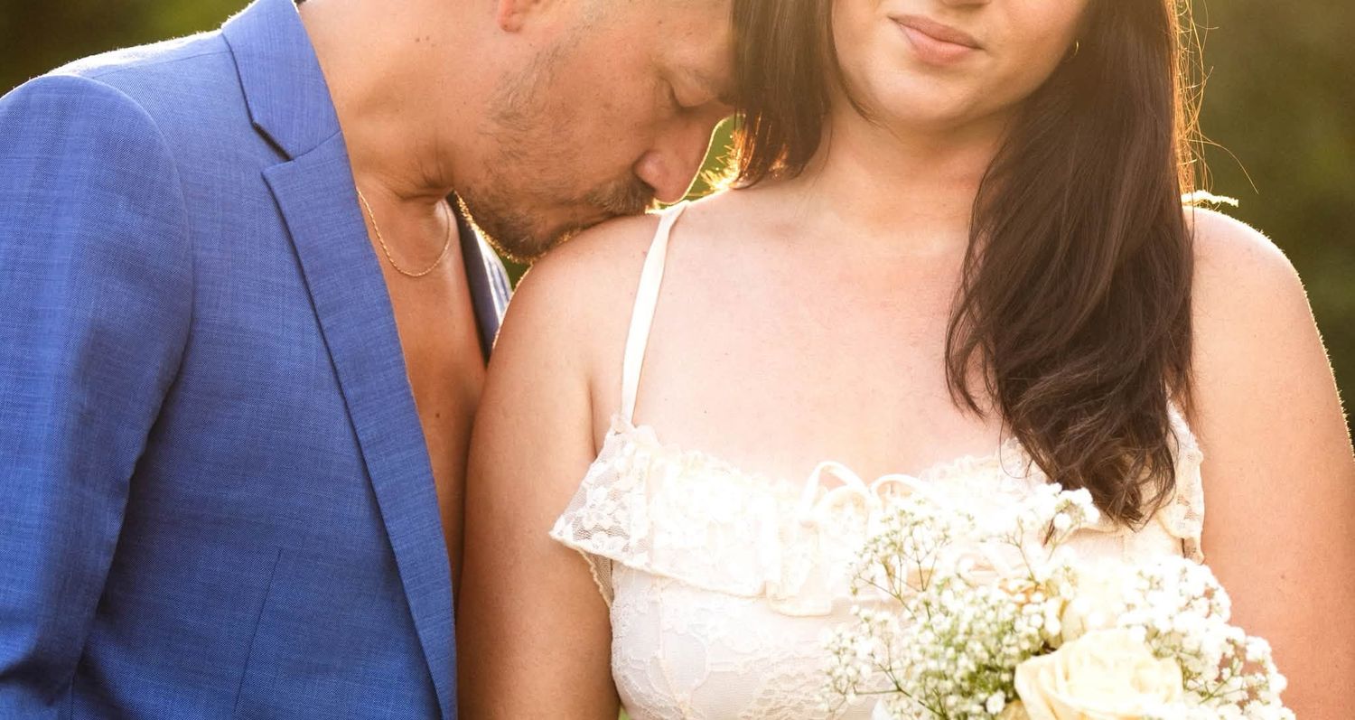
Here's something a lot of people miss: "neutral" doesn't mean one specific shade. When we say pick a neutral, that could mean bright crisp white, soft off-white, warm ivory, or sandy cream — and which one you should wear depends entirely on your skin tone.
- Very fair skin often gets washed out next to a bright, stark white — it can flatten the skin and remove warmth. A soft ivory or warm off-white usually looks much richer and more alive.
- Medium and olive skin tones tend to have more flexibility, but often glow most next to warm ivory or champagne tones rather than cool, blue-based whites.
- Deep, rich brown skin can carry a bright, crisp white beautifully — it creates striking contrast and really lets the skin's warmth and depth shine, in a way that a stark white might wash out on someone fair-skinned.
So when you're choosing your "neutral," don't default to whatever white is in your closet — ask which version of white or cream makes your skin look most alive. That's exactly why some people choose ivory or champagne over bright white for a session — not because it's trendier, but because it works better with their undertone and the warm light of golden hour.
Picking Colors for Your Skin Tone
This is the part that makes the biggest difference, and it's simpler than it sounds:
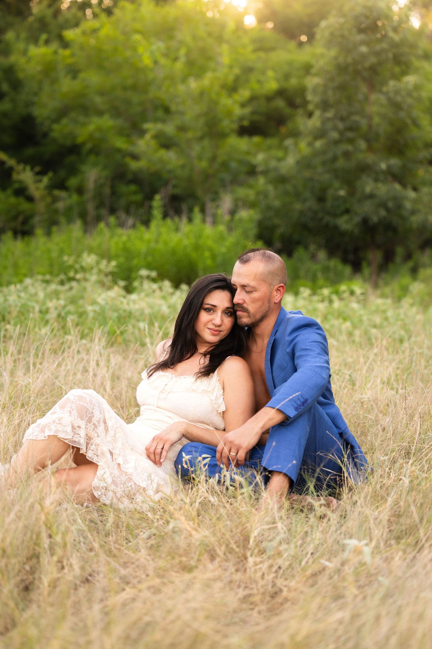
- Warm undertones (golden, peachy, olive) glow next to warm accent colors — rust, terracotta, mustard, cornflower blue, sage.
- Cool undertones (pink, rosy, blue-based) look beautiful next to jewel tones — emerald, wine, navy, cool blush.
- Golden hour light warms up every skin tone, which is part of why a cooler color like blue still works so well in an outdoor sunset session — the light balances it out.
Don't just pick your favorite color out of context — pick the one that makes your skin glow in the type of light you'll be shooting in.
Texture Is the Layer People Forget
Color gets all the attention, but texture is doing just as much work in a photo. If color is what draws the eye in, texture is what gives it something to linger on once it's there.
Here's why it matters:
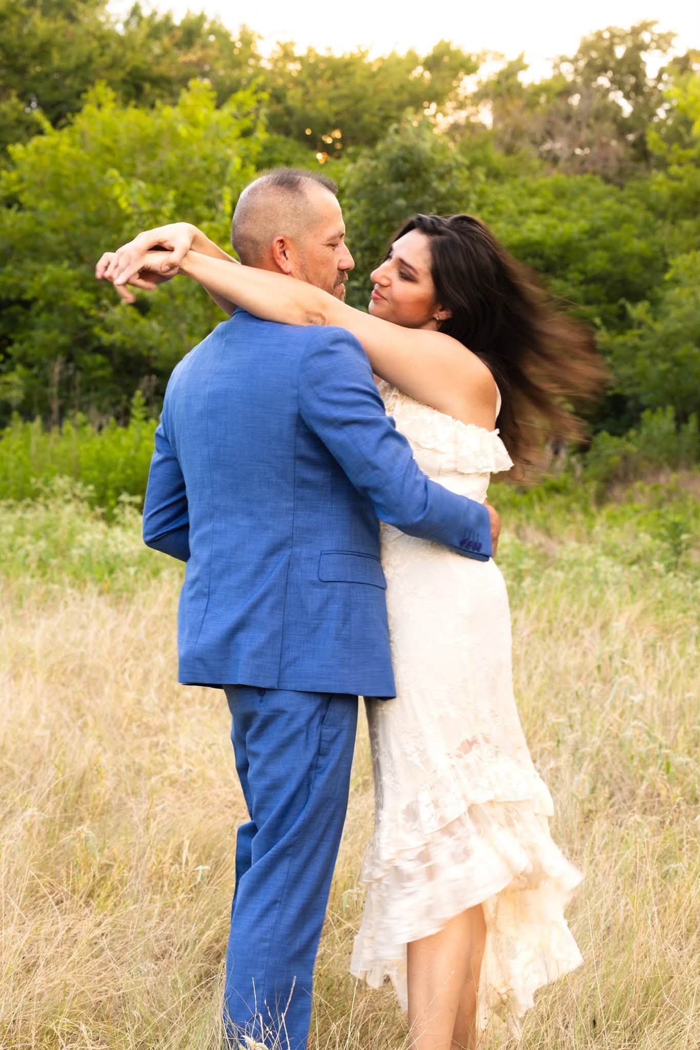
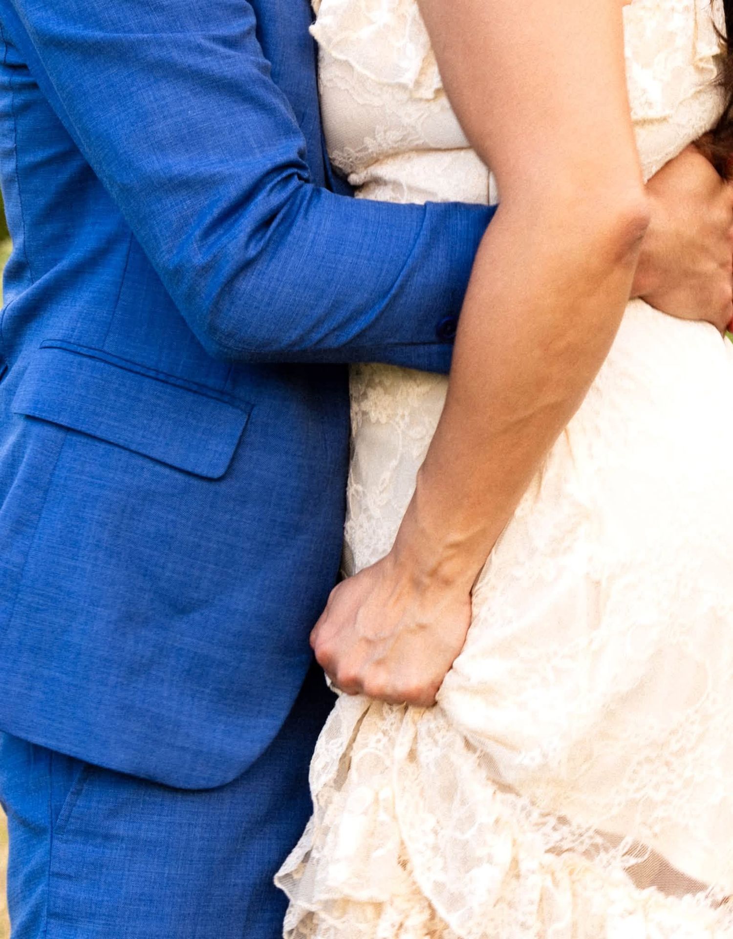
- Texture adds depth without adding a new color. A chiffon or lace fabric catches and scatters light in a way a flat, smooth fabric doesn't — it creates movement and softness even in a still photo.
- It creates contrast on its own. Pairing a soft, textured piece (lace, chiffon, linen) with something structured and smooth (a tailored suit, a crisp shirt) gives the eye two different things to notice — even if the colors themselves are simple.
- It photographs beautifully in motion. Flowy, textured fabric moves with you — in a walk, a spin, a breeze — in a way a flat fabric just can't. That movement is often what makes a photo feel alive instead of posed.
- It reads as intentional, not accidental. A simple two-color palette with mixed textures looks styled and considered. The same two colors in flat, texture-less fabric can look a little plain by comparison.
So when you're picking your outfits, don't just think about color — think about how the fabrics feel and move. Lace, linen, chiffon, waffle knit, and soft cotton all bring something different to a photo, even within the same color.
A Few Fabric Notes
- Flowy, textured fabrics (like lace or chiffon) move beautifully — great for walking shots, a slow turn, or being lifted or twirled.
- Structured pieces (like a tailored jacket or button-down) hold their shape and give a clean, grounded line next to something softer and more textured.
- Sticking to two colors with a mix of textures means the outfits stay simple, but visually interesting — and the moment between you two stays the real focus of the photo.
Quick Checklist Before Your Session
- Pick ONE neutral (cream, white, sand, taupe)
- Pick ONE accent color that complements your skin's undertone
- Let the outdoor greenery be your third color
- Choose fabric that moves well for the neutral, holds shape for the accent
- Trust the golden hour light to do the rest
Not sure which colors will work best for you? Send me a photo of your outfit options before your session and I'll help you choose the combination that will photograph best for your skin tone and location.
